


You’re standing in front of your closet with an indifferent look on your face. The coat hangers may be buckling under the piles of shirts, trousers, and dresses, but let’s face it: you have nothing to wear. Over the last few years, your fashion taste has changed and your old clothes don’t express your personality as well as they used to. You need a total makeover.
Sounds familiar? Believe it or not, companies face the same dilemma once in a while. Today, more than ever before, businesses have to make sure that they keep up with the constantly evolving industries and the ever-changing expectations of clients. Modifying the existing services and even offering new ones is effective but not enough anymore.
To maintain competitive advantage, brands need to update not only its sales deck but also its corporate identity. The refreshed logo, color scheme, and tone of voice are a good way to reassure current clients of the company’s expertise and flexibility. It also helps spread the word of the firm’s disruptive potential to the yet unreached prospects. Such changes do not lead to a comprehensive rebranding; however, as we have seen with our brand refresh, they ultimately make a big difference.
Bringing the creative software house to life
The story of Apptension began in 2009 when its founding fathers met at the Poznań University of Technology. Back in the day, they studied Information Technology and would from time to time join forces to work on both research and commercial projects. The three fellows soon found common ground thanks to sharing the thirst for knowledge and passion for state-of-the-art tech.

Apptension’s founding fathers (from the left):Artur Gutkowski, Michał Kleszcz, and Zbigniew Czarnecki
A major breakthrough in their programming careers happened three years after their first meeting. It came with the 3rd Poznań Hackfest, for which Zbigniew, Artur, and Michał developed an app that was awarded first place in two categories: Best Design and Most Creative Interface. Part of the prize was securing a spot in a co-working space that would facilitate their work on projects yet to come. That was also the place where the idea of establishing a one of a kind creative software house came to life.
Establishing Apptension’s identity
The founding fathers decided to give the company a name that would reflect its values and pretty much speak for itself. In Apptension, app stands for web application development and tension points to the creative friction that is an inherent part of the project launch process. With the name came the 3D logo which cleverly combines all the letters that you can find in the word Apptension. Here’s a cheat sheet for all who might have difficulties spotting it at first glance:

As far as Apptension’s mission is concerned, we knew from the very beginning that delivering the code should be just a tip of the iceberg. Our goal was to provide comprehensive solutions and, as of today, we can surely say that we’re doing a pretty good job achieving it. Currently, bespoke software development is only one part of our all-round adaptable process which additionally entails such stages as pitching, discovery, and design.
A fresh lick of paint
Our values haven’t changed significantly over the last couple of years: it’s still all about hard work, high quality, and team-first attitude. At the same time, however, we can’t deny the fact that we’ve grown in many ways since 2012.Today, we’re a 60-person challenge-driven team of development, design, quality assurance, project management, and growth experts. Our technical expertise and uncurbed creativity allowed us to turn from just a tech vendor to a fully fledged production partner to the world’s leading agencies, major brands, and innovative startups.

And that’s just to name a few of our brilliant clients. You’ll find out more about them in our case studies.
With dozens of successful sketch-to-launch collaborations, the time has come for us to make our experience and potential known even better to clients, prospects, as well as future and current employees. And what better way to show our progress than with a refreshed corporate identity.
The three colors
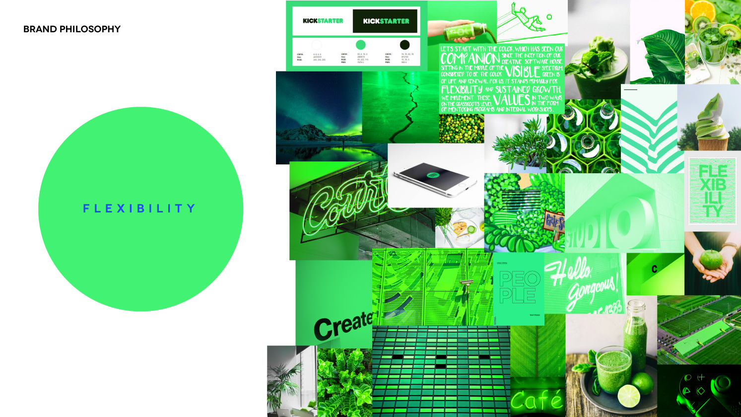
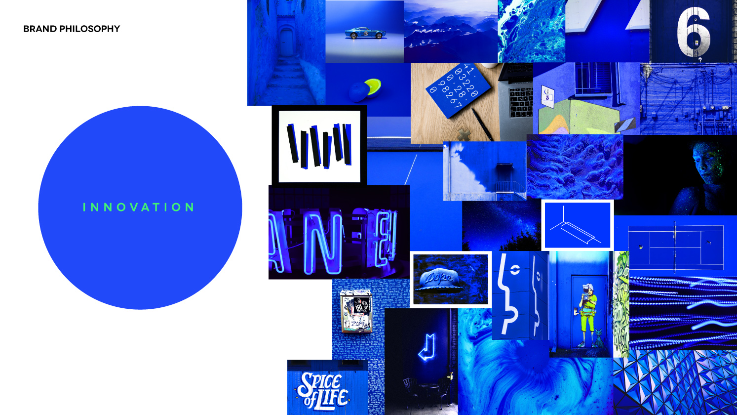
The psychology of color has been contemplated by academics, business people, designers, and many more for decades now. It was already in 1810 that Goethe assigned symbolic meaning to particular hues by linking them with six features: beautiful, noble, good, useful, common, mean. While at the end of the day, everybody perceives respective colors differently, there seem to exist some culture-ingrained meanings that rise above neurological and personal factors. Putting them into branding practice allows to paint a relevant picture of the company’s personality.Bearing this fact in mind, we made the modification of the existing color scheme a central part of the brand refresh process. At some point in Apptension’s journey, we felt that using different shades of green was no longer enough to express who we really are. Drawing on the basic principles of color psychology, we built a color triad that is a perfect visual representation of our identity which we see in green, yellow, and blue.
Let’s start with the color, which has been our companion since the inception of our creative software house. Sitting in the middle of the visible spectrum, green is considered to be the color of life and renewal. For us, it stands primarily for flexibility and sustained growth. We implement these values in two ways:
- on the grassroots level, in the form of mentoring programs and internal workshops like Frontend DevTalks
- on a larger scale, by speaking at conferences and participating in socially responsible initiatives such as the 2019 Trash Challenge

The second color is warm and cheerful yellow. Attracting attention with its brightness, this hue represents the disruptive potential that stems from our ability to mix outstanding tech skills with a strong dose of creativity. With such skills, we are capable of helping agencies, startups, and investors translate ideas into unforgettable digital experiences that will make them stand out from the crowd.
Finally, there’s also blue which brings to mind the serenity of the sea and the sky. At Apptension, this color stands for all types of responsible innovation, including strong work ethics, up-to-date tech radar, careful quality assurance, and well-managed product development.

It’s worth noting that we didn’t go for a triad by accident. As our CEO observes, number three has been our lucky number for quite some time:
It all started with us, the three founders, who decided to combine their unique skills to create Apptension. Then, we decided to focus on three different types of clients and tailor our services to their needs. Finally, there are also three floors in our office, each with a different vibe to it. I think we just like this number.
The two fonts
Another part of Apptension’s brand refresh was the change in typography. We pay special attention to the quality of every text we write. That’s because we know that the informative and engaging content improves brand awareness and shows both current and prospective clients our expertise. However, we’re also aware of the fact that even the best article can become less credible and enjoyable when it uses an inappropriate font. Just imagine reading an instructive article on UX design written in Comic Sans.
A font is a dealbreaker, isn’t it?To ensure that even the visual side of the content branded with Apptension’s name will reflect our core values, we went for two typefaces: GT Sectra and Proxima Nova.

The former, in the words of its creators, “combines the calligraphic influence of the broad nib pen with the sharpness of the scalpel knife [which defines the font’s] contemporary look”. Sophisticated, yet legible, GT Sectra is definitely a personality typeface. Thus, it’s used at our company primarily for headlines which, often surrounded by dispersed geometrical shapes, are to convey the ingenuity of our designs and out-of-the-box approach to client’s requests.
The second font we decided to incorporate in our refreshed corporate identity is Proxima Nova. Being a sans serif typeface, it is clean, minimalistic, and easily displayed at different screen resolutions. As Mark Simmons, the font’s designer, puts it, “Proxima Nova (...) works best in situations where you want something kind of invisible that doesn’t call attention to itself”. Since the typeface doesn’t superimpose any additional meanings on the text’s message, it lets our words speak for themselves.
The one and only logo
The last element that had to undergo a refresh was our logo. Bearing in mind the fact that the logo should be the recognizable and easily reproducible visual essence of the brand, we decided to streamline its original 3D form. We also felt that with green, yellow, and blue defining our image, the old lime hue would no longer fit the overall color scheme.
The result? A minimalistic 2D design which, regardless of its simplicity, still contains the outlines of respective letters found in the name Apptension. The black-and-white form might at first glance come across as plain; nonetheless, we made sure that the design retains an element of surprise.
We are ingenious individuals who think outside the box; however, our creativity is anything but flashy. For this reason, we didn’t go for elaborate shapes or extravagant colors, which might be eye-catching but don’t reflect Apptension’s personality. Instead, we decided on adding an animated touch.

The refreshed logo pulsates with the inexhaustible energy of our team. The spatters which come together into one form are like a combination of individuals with unique skills whose collaboration contributes to the company’s success.
That’s exactly what we do on a daily basis: we solve complex technological puzzles which challenge us, force us to learn, and allow us to accomplish spectacular goals. The explosive logo is not a gimmick – it’s just as significant to building a coherent image of Apptension as the color scheme or the typefaces.

What does the brand refresh mean in real life?
The change of the corporate identity usually entails the revision of the brand’s goals, target audience, and the way it’s perceived. In our case, the soul of the company stayed the same. Whether it’s supporting our clients in the pitching process, looking for ingenious technological solutions or running product design workshops, we still put our heart and soul into writing the code. With 7 years of experience, however, we wanted to fine-tune our image to make our mission and accomplishments shine even brighter. Hence the new colors, fonts, and the altered logo.

The revamped headquarters
What changed significantly, however, were Apptension’s guts. Office renovation took almost 3 weeks (that was the reason for introducing the remote work only period, which you can read about here) but it was well worth the wait!

Our revamped headquarters sends the message of who we really are. That’s “hackers, artists, freaks, geeks, focused and well-aligned individuals who are like a real family and that’s not a cliche”, in the words of Zbigniew Czarnecki. And such a unique mixture of unmatched personalities simply needs an equally unique workplace.

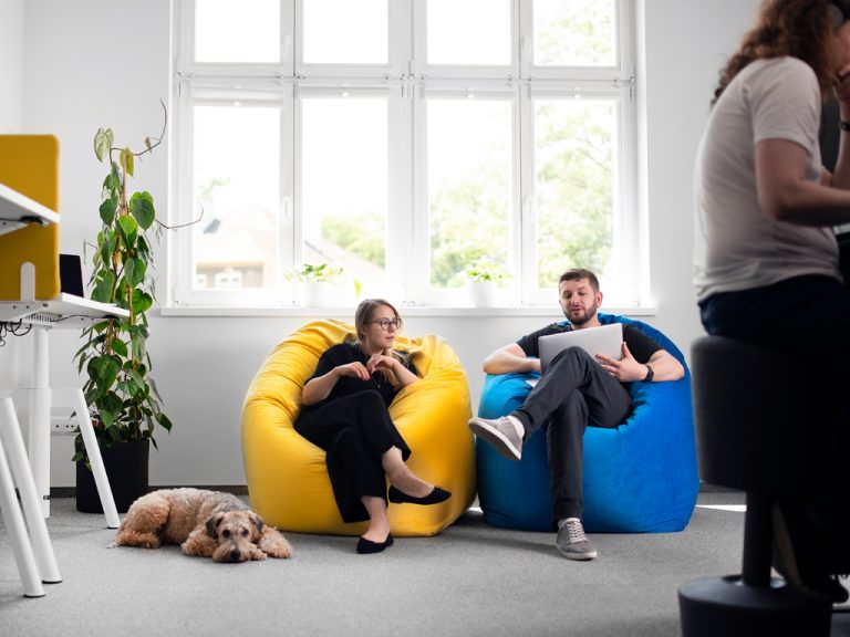
Green, yellow, and blue have become an inseparable part of our work day. They can be seen on the walls, chairs, sofas, and partition walls which allow us to add a personal touch to our desks. Remember how we told you that the refreshed logo is black and white? So are our desks which fulfill the needs of those who enjoy darker and lighter workspaces.
The familiar rooms underwent a complete metamorphosis as well. The conference room was moved to a more spacious and brighter location. With a large table, indoor plants, and a big TV screen, it’s now more representative than ever.

As we work with clients from all over the world, calls are our daily bread. That’s why during the renovation an additional conference room was created. It differs from the one described above in being comprised of several smaller spaces that allow multiple meetings to take place at once. Now, you’ll find there Bluetooth controlled standing desks, 2 soundproof booths for up to 6 people, and anti-scoliosis stools.
The thing that impressed me the most was our former conference room. It has been totally transformed: from a simple workspace with a big table and a whiteboard to the place where you can meet with your team sitting in quiet sofa hubs or just work for some time at a standing desk.
Ada, Growth Manager at Teamdeck

The last place to be considerably transformed was Sandbox. To the delight of our avid gamers, PlayStation and TV were moved and a cozy FIFA corner has been created.

The fridge, which has turned out to work miracles when we need a quick sugar rush to save the day, still stands in the chill room. Now, however, it is placed against an impressive Pacman-inspired wall.

We’ve talked about creativity a couple of times in this text. If you enter our office, you’ll see that these are not empty words since. The walls of Apptension’s refreshed headquarters are decorated with pieces of art by Noriaki, a street artist from Poznań whose Watchers can be found on the street of the biggest European cities.

To sum up, brand refresh was an exciting experience for us. It made our office life more colorful and allowed us to redefine our image across a variety of touchpoints with both clients and future employees. We hope that this redesign case study of sorts will inspire you to change your reality as well.